

Smartphone have become necessary and are carried everywhere. For this reason, designers are challenged to present information previously displayed on a monitor screen now on a smartphone screen. Another challenge is that designers must adjust to the various structures of mobile devices with different types and screen sizes.
With the advancement of technology, designing according to the needs of smartphone screens is no longer a problem. Design applications such as Figma, Adobe XD, or Sketch, designers are given the alternative to choose which design application to use to create a UI/UX design concept.
In the past, we have written an article about increasing conversions with UX design for digital businesses to ensure their products have a good user experience. At this time, we will talk about UX designer tips to make your UX design more attractive to the users.
Summarized from several digital media and based on experience and research, here is a list of simple tricks and techniques that will help you complete large projects in terms of User Interface and User Experience design in mobile design.

Who is your mobile design targeting? It is essential to know that before designing a mobile UX concept, you must first understand the market segment that you want to reach so that the UX design can meet the market. If you don't see your product's end user, it is possible that the user will not accept it because it does not meet their criteria. How to determine the user segment of the application to be created? Following the purpose of UX design, from the material and product, we can analyze categories such as target audience based on gender, user age, education level, and language.
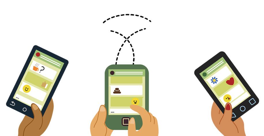
Ensuring accessibility means making your product usable by the maximum number of users. In the initial design stages, it is crucial to consider the most common ways users hold their smartphones. This approach helps create a design that facilitates easy access to the primary features of an app.
There are generally 3 ways users physically hold the phone: left-handed, right-handed, or a combination, so in UI/UX design, the main actions match these areas.
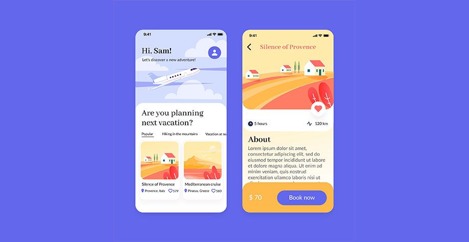
In the heyday of the smartphone era, some search engine providers like Google also prioritize mobile users in terms of serving web pages or applications. Thus, it is crucial in this case to present data and information so that the text on the mobile can still be read clearly and combined with images that match the size of the mobile screen.
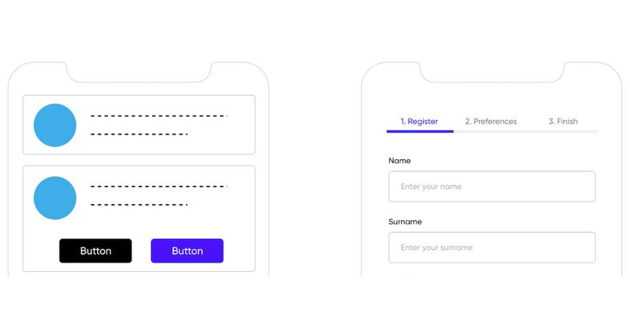
One of the keys to a good user experience is to maximize the information data presented on the mobile screen by reducing long scroll downs. Use tabs or carousels to create the shortest possible screen with a 'tap to expand' feature or break the function into multiple screens.

The choice of font and size provides aesthetics to the information presented. Mistakes in font selection can ruin a design, and many designers spend a lot of time on this to get the best results. Also, please pay attention to the color contrast of the text so that users can easily read it.
Displaying information on a mobile screen does not mean using a smaller font size or a size between paragraphs that are too close, but rather the same as the display on a desktop screen so that users can skim the information. The padding distance between paragraphs is also one of the things that is considered. A close distance will reduce the readability of the information and damage the design. Determine appropriate padding and line height in design to prevent crowding between paragraphs, text links, or buttons (CTAs).
Excessive notification information will interfere with the user operating the application, such as email notifications, chats, promotions, or calls that appear simultaneously. Mobile app designers should always prioritize minimalist features in their designs, which will help users avoid distractions that can be irritating when operating the app.
![]()
To create an effective design, it is important to carefully select icons that are recognizable and familiar to users to ensure clarity. The typical order for the navigation menu in the design needs to be customized, such as the iOS tab bar or the navigation menu on Android. Smartphone users are used to these familiar patterns, so your app will be more intuitive.
Conclusion:
In the UI/UX design completion stage, testing is recommended to determine user satisfaction with the application to be created.