User Interface, or UI, is an important part of how we use machines in the field of industrial design. It's the place where we interact with machines and tell them what to do. At the same time, the machine gives us information that helps us make decisions. The goal of all this is to make it easy and effective for us to control the machine. So the user interface is like a go-between for people and technology, helping us work together smoothly.
The font used in a user interface can impact its overall appearance and appeal to users. Carefully selecting a font can significantly improve the user experience. There are several factors to consider when choosing a font for your UI, including readability and aesthetics, for a better user experience.
Font design can make you can quickly determine what kind of information a website offers when you visit it.
The interaction between the users and the website owner is provided by how the contents are organized, the colors and fonts used, and other minor aspects.
The fonts boost your text. Typography makes it simple to hook readers, but it takes more creativity to keep them interested. You can stimulate readers' attention to the topic by highlighting compelling texts. Typography can enhance their aesthetic appeal if used correctly.
Fonts that are simple, formal, and plain should be used if your subject demands some seriousness. Understanding of the information is influenced by font selection.
The most crucial texts should be distinguished using different font styles and sizes. Larger font sizes can be used to draw attention to the key points. The audience will find it easier to decide whether the information is worth paying closer attention to.
While consistency is achieved by using the same font throughout similar content, harmony should still be added to provide an artistic effort. Your design is organized and clutter-free when the fonts are positioned correctly and in the appropriate proportion.
Typography highlights the significance of the information you offer. When a font is used correctly, it shows a high level of professionalism in a design project. Customer trust is increased by using text size and typing appropriately. If the focus of your website is business, this will help with the marketing of your goods.
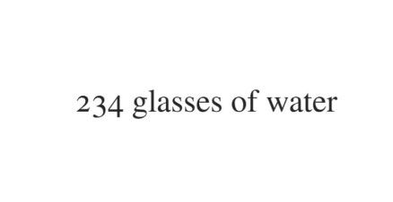 1. Times
Because of its clear contrast and condensed design, Times is a highly readable serif font. Due to its widespread use in many media, including novels, messaging apps, and commercial publishing, this font is generally well-known. Times was first primarily used in printed media, such as newspapers, and has since come to be linked with scholarly writing and journalism. So, if you want to give your website a recognizable and official vibe, this font is a perfect choice.
This font is also appropriate for blogs and websites with large text blocks, such as online newsrooms.
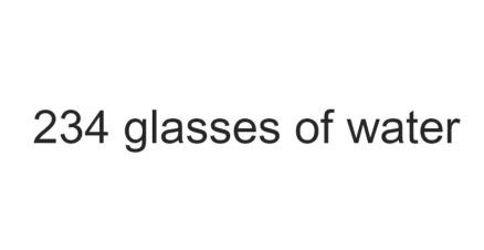 2. Arial
Having a contemporary look, Arial is a multipurpose sans-serif font. Each letter's broad and solid construction creates a simple, modern appearance.
The readability of Arial at any scale has made it a standard screen font. In addition, this font is widely used in printed materials like advertisements and newspapers.
Arial is ideal if you're searching for a basic font that will work well for most websites.
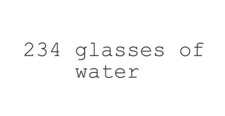 3. Courier
In the category of slab serifs, Courier is the most well-known font. Similarly, movie screenplays have traditionally used this HTML typeface. If your website is related to a movie, definitely consider using Courier.
However, it's best to limit its use to headers and titles since this font is classified as decorative.
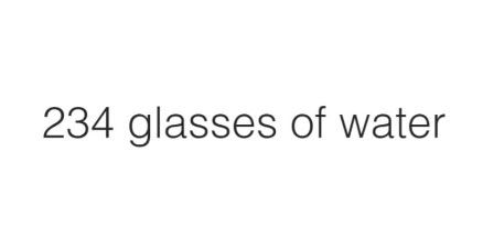 4. Helvetica
It is a popular sans-serif typeface that many well-known corporations adopt. Jeep, for instance, uses this font for its logos, as does the United States government for tax forms.
Additionally, this font style is made for small-size applications like text displayed on mobile devices and e-readers.
5. Verdana
Verdana is a great on-screen typeface because it can be read in small print and low-quality screens. It is mostly because of the characters' wide spacing and width.
This font is a perfect option if you're seeking an HTML font with excellent readability.
Your website will seem consistent across all devices if you use an HTML web font. Depending on the font used, it will also give the website a professional, formal, or elegant appearance.
Because each font has its own style, be sure to pick one that is readable and appropriate for your business.
LIFE’S ONLY DIRECTION, FORWARD.